Film Festival Posters


The ripped out bit of poster is in the shape of a classic 16mm film camera. This was the spark for one of my own designs as I thought it worked extremely well and was simple, yet very effective.
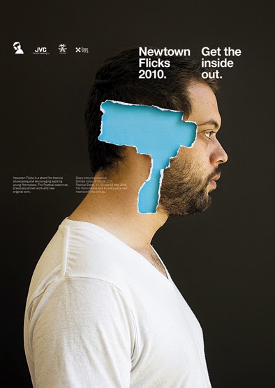
 This poster has a similar concept than the previous one, in the sense that film makers think through the lens. However this one has a more retro look to it, and might also be representing a film projector, rather than a film camera. One important thing to notice is that the projector, or film, is powered through the heart.
This one caught my eye because it has a retro look, which is what I want to make my own poster like.
 This poster is a very simple design, similar to what my client would like to have his poster. I also found it especially clever because the blade of the samurai sword is actually film footage.
As I mentioned, it's an extremely simple design which works exceptionally well and gives the effect of not needing much else in the background.

Initial Idea 1 - I wanted to create a simple, yet eye-catching poster, so I decided to use only one image and two colours; black and white. This would give a nice contrast and stand out from the rest.
To create this poster, I firstly downloaded an image of someone using a clapperboard. I then imported it into Photoshop and used the fill tool to make it all a solid colour, white. I then added a black background to make the image stand out.
I used the text tool to add some words to the poster, which were 'Tees Fuse Festival'. This was to make sure everyone knows what the poster is promoting. I added the outline of a rectangle around both pieces of text to make them pop a little more. I used the shape tool to create these. I thought the general date was a good bit of information for the poster, so everyone knows if it is soon. So I added '2015' to the clapperboard. This would have been changed to the actual date if chosen, but I didn't know the festival date at the time of creation.
Initial Idea 2 - For this design, I wanted to try and add a little more colour to the poster and make it pop out.
I firstly downloaded a suitable image of an old film reel and then imported into Photoshop to edit. Luckily the image had a transparent background so no work had to be done to the background. I scaled the image up and moved it around until I was happy with the position. The film reel can be seen getting smaller as it goes up the poster, drawing the viewers eye into the text at the top.
The text was added using the text tool again and a similar text was added to the poster; 'Tees Fuse Festival, 2015'.
I used the fill tool to add the light green colour to the background. I also used the fill tool and added a slightly darker green to the film reel, which makes the poster look almost 3 dimensional.
Initial Idea 3 - I wanted this design to be unique and interesting to look at. The original idea sprouted from one of the posters I looked at when I received the brief, which is shown above.
I searched Google for a silhouette of a head and an old film camera. When I found the images that suited my idea the best, I downloaded and imported them into Photoshop, just as I had done with the other ones.
In Photoshop, I scaled the images to size and positioned them correctly. I then used the fill tool to get the right colour scheme for the poster. I chose a soft blue for the background and camera and a very dark grey for the head.
I used the text tool to add the writing and then spent a while deciding upon the right font for the poster. I placed the two pieces of text apart from each other, as I thought it was more effective that way.
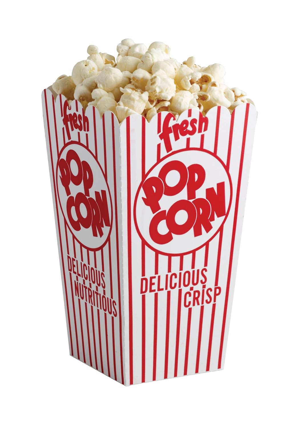
The first thing I had to do for this design was find a 1950s popcorn bucket image. After that I used the Eyedrop Tool to select the colour of the bucket's background and then use the Brush Tool to colour it out. Luckily the background colour is consistent and doesn't change much so simply using the brush tool did the job.
The next step was to add the information and text onto the bucket. In the same way as the first idea, I wasn't too concerned about the font as it was simply to get across where and what the text would say. I used the Eyedrop Tool to give the text the same colour as the red lines and the original red text on the bucket. Also if this would be chosen as the final design then the text on the sides would also have been changed to the same as the front text.

The final thing to do was to add the tickets to the project. I had to remove the background and rescale and rotate it. The good thing of having the tickets is that it would cover the top of the bucket, meaning I won't have to edit the text on that bit of the bucket.
This idea is my favourite out of the three initial ideas. If this idea gets picked to be developed as the final design then I will have to look for a better quality image of the popcorn, as the image I used for this initial idea is small and gets broken up significantly when enlarged.
 Initial Idea 3 - This design was very simplistic and in a way I wasn't satisfied with it, not because it doesn't look good, which I think it looks very appealing, but because there wasn't much of a challenge to create and edit it.
The first thing I did for this design was to find a good sketch of a 16mm classic film camera, luckily I found one which was at a high resolution. I opened that image on Photoshop and removed the background using the Magic Wand. I had to use the Quick Selection Tool also to remove and add some places which need or did not need to be selected. Once I removed the background I imported it to the project and scaled and centred it accordingly.

After that I created a new layer which I would use as the background. I gave the background a very light green colour and also gave it a texture using an image which I found on the internet. This would give it less of a bland appearance.
To make the camera blend in more onto the design and not seem as its something glued onto it, I turned the opacity down to 90%.

The final thing I did was to add a text layer using the Text Tool. Unlike the previous designs I chose a suitable font for this one, as I felt like this one was closer to a finished product than the others. I used a pre-set font which was already installed on Photoshop and scaled and centred it accordingly.
As I mentioned previously, I felt like this design wasn't good because all I had to do was put an image on to a background. However the end result is very nice and looks appealing to the eye.
 After submitting the initial ideas to the client and receiving back the feedback, the client wants me to create a final design of the popcorn and cinema ticket idea. I'm really glad that one was chosen, as personally that one was my favourite one and I feel like it gives me a challenge to create it to a professional standard on Photoshop.
The first thing I had to do was find an image of a 1950s style popcorn bucket which was large enough to use on an A3 poster, and wouldn't break up or look pixelated.
 I found this image on the internet, http://ecx.images-amazon.com/images/I/813B3KiPUML._SL1500_.jpg, which is a good size and good quality for my project. The image is from an American Amazon.com item, and upon further research I couldn't find any form of copyright on the image so I decided to use it, as I was unable to find the photographer so I could possibly contact him asking for permission.
 The first thing I did on Photoshop was open a new project and made sure the image size was set to International Paper A3 size.
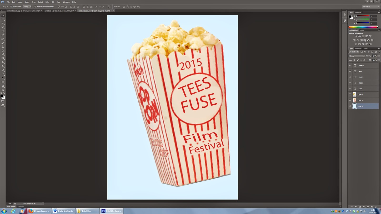
 Then I opened the image of the popcorn bucket on a separate project as it will take a lot of editing and doing that on a separate project is more convenient.
I removed the background using the Magic Wand tool and made a copy of the layer and turned it invisible. This is to have a reference of the original and have constant comparison to the original design, as I want it to look as similar to the original as possible.
 I used a combination of the Brush and the Clone Stamp Tools to remove the original text. On certain places the background colour wasn't constant and changed too much, so I had to use the Clone Stamp Tool there, however on other smaller spots the background colour was the same tone throughout, so I was able to use the Brush Tool there.
 I continued to repeat the same process on the side of the popcorn bucket. This side was a little more difficult due to the perspective and angle in which it's available.
 I looked on the internet for 1950s cinema style fonts, and found one called Carter One which was suitable for this design and appeared to be original. http://www.1001freefonts.com/carter_one.font.The creator of the font has made it a public domain, so I did not have to worry about copyright issues for this font.
 I used the Text Tool to create each letter individually into a different layer, as they would have to be tilted at different angles and also had to be at different distances from one another.
Once I created a text layer I used the Eyedrop Tool to get the same colour as the red lines on the bucket. I also added a stroke which is the same colour as the background. Once I did these things for the first letter I simply duplicated the layer to keep the same attributes throughout and not have to do each of them individually by hand.
 To include the location of the event I used the two spaces at the bottom of the bucket. This time each word was just one layer and did not have a stroke as it was unnecessary. I had to manually scale the layer size as it would not fit into the gap with it's standard ratio. This wasn't a problem as it was only minor adjustments and the text did not seem too stretched out, however it took quite a lot of time and attempts to get the right size and tilt on the layer to make it fit into the given gap.
 Doing the side of the bucket was a little more complicated. I used the Magnetic Lasso Tool to select the circle in which "Cine Fest" is in and duplicated it. Then I held CTRL and manually rescaled and changed the perspective of the layer. This was hard as the layer had to have a realistic look and not look stretched. After all, this would not be a major issue as the majority of the "Cine Fest" on the side would be covered up by the cinema tickets, but it was important to have changed it anyway as some of it would still be visible and it would give the poster a much more realistic and professional look. To ensure the same tone of shade was on that layer as it is on the side of the bucket, I gave the layer a black colour overlay and turned the opacity for the overlay down to 20%, I played around with the opacity to see which would be the most similar to the rest of the side.
I repeated the same process for the location text layers. However as the original image had a different word at the top on the side as it did at the front, the gap wasn't large enough to fit the word "Middlesbrough" in without making the layer unreadable. So I had to use the Clone Stamp Tool to make another split in the red lines and give some extra space to fit the word in. Given all this the text still looks a little cramped, however the main focus would be on the one on the front.
 Once the popcorn bucket was edited and finished, I exported it as a .PNG and imported it into the poster file. I gave it a little tilt and imported the cinema tickets.
The image of the cinema tickets are from an independent film maker company's website. https://the72project.files.wordpress.com/2014/02/cinema20ticket.jpg. I looked around on the website and saw that they give permission for anyone to use their images as long as they are not altered.
I scaled and tilted it accordingly and positioned the image so it would cover up the top of the side of the bucket and quite a lot of the middle text also.
I also gave the background a very light blue tone, so it wouldn't be on a plane white background.
I was able to meet the client in person (because of this I am unable to give any form of screenshots as to what we discussed) and have a discussion about the project. I showed the client the progress I had so far and asked if it looked good. The feedback I received was that it didn't specify the fact that it was a student festival, and recommended to include that somewhere on the poster. I decided the best thing to do would be to change the text on the cinema ticket which says "Cinema Ticket" to "Student Festival".
To do this I imported the original image of the cinema tickets into a separate project on Photoshop.
 To remove the text I used the Clone Stamp Tool, and even though the background has a texture and pattern, due to the fact that this pattern is random I had no problems with using this method to remove the text.
Once it was all removed I asked multiple people if it was obvious that I had removed the text, I received good feedback was told it was not obvious. Even if it would have been slightly obvious, having a text layer over it would ensure it wasn't visible.
 Luckily the font which was used on the ticket was a standard font and it was available as a pre-set on Photoshop. All I had to do was make sure that the font size was the same and the thickness of the letters was also the same. Once the text layer matched the original text style, I tilted the text so it's parallel to the line just beneath it, and then centred it between the two stars on each side and made sure the space to the line was the same as the original text.
 Once I finished editing the cinema tickets I replaced the previous ones with the edited one.
Once again I was able to meet the client in person and show him the poster. I also explained to him how the date and logo would go at the bottom just below the popcorn bucket, which was fine by him. I also pointed out how next to the "UK" at the top of the bucket, the line was split, which had no reason to. The client asked me to join up the line, which I did immediately.
 All I did for this process was move the "UK" slightly further to the left, and using the Magnetic Lasso Tool, I selected the available red line which had split. Once it was selected I duplicated it and moved it up until the bucket ended. To smoothen it out I used a combination of the Clone Stamp Tool and the Brush Tool to make sure it wasn't visible that it was copied and duplicated. I also had to get rid of the excess which was off the bucket, so I used the Rubber to rub it out, but made sure it was on Brush and not Pencil or Block, to give a much smoother edge compared to what the other two would have given.

I exported the finished product as a .PDF and a .JPEG which is saved for web and submitted that to the client.

 I feel like the most successful part of my design was the cinema ticket, which is a very clever, creative and effective way of getting the information across. Another successful part of the design the font used and the way in which the letters for "Cine Fest" are organized. The font seems natural and looks like it really is part of the original popcorn bucket and suits the 1950s retro style of the bucket. The alignment of the letters works well as it stands out and is the first thing seen and engages the viewer to further read the information on the poster.
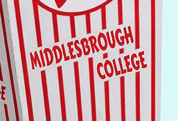 The one thing which I find didn't go so well and is rather off putting, is the "Middlesbrough" text. This text looks a little too crowded, this also applied to the text on the side of the bucket. This is the thing which I find makes the naturalness and originality fade from the project.
 Comparing it to this poster, from the Glasgow Film Festival, which I used as a guideline, there isn't any text which seems crowded or doesn't have enough border space. On some instances the text is close to the border but this is neutralized by the fact that other text goes over the border, implying that is the style the creator went for and did this on purpose. It is also clearly visible that the text has even and consistent space to either the red lines by it's sides or other text above and below it.
The class were given a brief to create a poster for a student film festival. We all set about the task by creating mood boards. The idea behind this, was to give each of us an indication on the sort of thing we should be making. I looked at many film festival posters from across the world, but decided to create a mood board with a film noir theme.
In reflection on my work, I think that this was a good mood board. However, not the one that fitted the brief very well.
I then began making my initial ideas for the film poster. I decided to go for three totally individual designs, which all gave off a different vibe.
PRODUCTION DIARY
The brief I was given consists of making an A3 poster for the UK Cine Fest Student film Festival. After talking to the client, I found out that he wanted a simplistic design which gets the point across in a creative and easy way.
I did some research on some previous professional designs, here are a few which I found particularly good:
The ripped out bit of poster is in the shape of a classic 16mm film camera. This was the spark for one of my own designs as I thought it worked extremely well and was simple, yet very effective.
This poster has a similar concept than the previous one, in the sense that film makers think through the lens. However this one has a more retro look to it, and might also be representing a film projector, rather than a film camera. One important thing to notice is that the projector, or film, is powered through the heart.This one caught my eye because it has a retro look, which is what I want to make my own poster like.
As I mentioned, it's an extremely simple design which works exceptionally well and gives the effect of not needing much else in the background.
This is my mood board for this project. Originally, I wanted to create a unique poster, with a very distinct feel to it. I love black and white and thought something similar to this would be great and attention grabbing for anyone.

EVALUATION
It also greatly implies that the poster is not a professional piece of work, and rather a student's. The "UK" at the top also seems a little out of place, and again makes it look less professional. Also due to the slight colour and brightness change at the top of the bucket compared to the centre or bottom, the "UK" seems too bright and gives the look that it was simply glued on.
Again comparing it to the Glasgow Film Festival poster, there is no bit of it which seems a different tone of the colour used. Due to it not being a real photograph, the same tone of the colour was used for every bit of it. which unfortunately I was not able to do, but could've attempted better. The Sydney Underground Film Festival is another good example which shows how both the white and red used on the bucket are consistent and do not seem off or of a different tone of red or white anywhere.
Again comparing it to the Glasgow Film Festival poster, there is no bit of it which seems a different tone of the colour used. Due to it not being a real photograph, the same tone of the colour was used for every bit of it. which unfortunately I was not able to do, but could've attempted better. The Sydney Underground Film Festival is another good example which shows how both the white and red used on the bucket are consistent and do not seem off or of a different tone of red or white anywhere.
I originally thought that this project would take me relatively long to finish, but was actually surprised by the simplicity of the tasks I had to do within the actual project. Because of this I had more time than I had planned and therefore feel like I managed my time well. I also had, as mentioned previously, plenty of time to discuss details about the project with the client in person and finish his requests by the next time we met. It was also great to receive verbal feedback and discuss the design in person as it meant that we could both come up with ideas and discuss them on the spot and agree if it should be used or not. I feel like the client and I had very similar ideas for this design, so it made it easy to receive feedback and analyse the project while it was in production.
Overall I feel like this project turned out extremely well and gave me the experience and knowledge of working for a client and making a poster to attract people to an event. I am highly satisfied with the final outcome and pleased in the way which I handled the time, resources and brief given. While certain aspects of the poster are not done to a professional standard, I feel that the finished design, if presented to the target audience, would want to attend, or at least find out more information about the event, which is the target of the poster I created.
If I would repeat this project I would make sure to detailedly analyse professional works and see how they have dealt with minor issues which can bring down the professionalism of the posters, as I feel like my major issue is just that, not being sure on how to adapt and change minor problems which can bring down the level of my work. I would also possibly find a different, or design and create my own popcorn bucket in Adobe Illustrator, as the one used for this project did not match what I had planned in my head, although it turned out rather well.
If I would repeat this project I would make sure to detailedly analyse professional works and see how they have dealt with minor issues which can bring down the professionalism of the posters, as I feel like my major issue is just that, not being sure on how to adapt and change minor problems which can bring down the level of my work. I would also possibly find a different, or design and create my own popcorn bucket in Adobe Illustrator, as the one used for this project did not match what I had planned in my head, although it turned out rather well.
INITIAL IDEAS
Initial Idea 1 - I wanted to create a simple, yet eye-catching poster, so I decided to use only one image and two colours; black and white. This would give a nice contrast and stand out from the rest.
To create this poster, I firstly downloaded an image of someone using a clapperboard. I then imported it into Photoshop and used the fill tool to make it all a solid colour, white. I then added a black background to make the image stand out.
I used the text tool to add some words to the poster, which were 'Tees Fuse Festival'. This was to make sure everyone knows what the poster is promoting. I added the outline of a rectangle around both pieces of text to make them pop a little more. I used the shape tool to create these. I thought the general date was a good bit of information for the poster, so everyone knows if it is soon. So I added '2015' to the clapperboard. This would have been changed to the actual date if chosen, but I didn't know the festival date at the time of creation.
Initial Idea 2 - For this design, I wanted to try and add a little more colour to the poster and make it pop out.
I firstly downloaded a suitable image of an old film reel and then imported into Photoshop to edit. Luckily the image had a transparent background so no work had to be done to the background. I scaled the image up and moved it around until I was happy with the position. The film reel can be seen getting smaller as it goes up the poster, drawing the viewers eye into the text at the top.
The text was added using the text tool again and a similar text was added to the poster; 'Tees Fuse Festival, 2015'.
I used the fill tool to add the light green colour to the background. I also used the fill tool and added a slightly darker green to the film reel, which makes the poster look almost 3 dimensional.
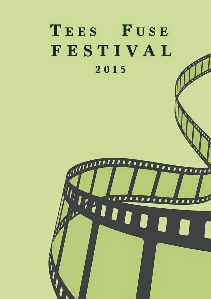
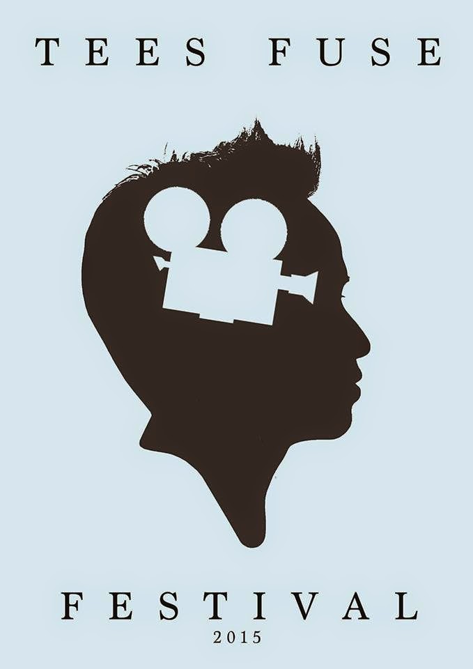
Initial Idea 3 - I wanted this design to be unique and interesting to look at. The original idea sprouted from one of the posters I looked at when I received the brief, which is shown above.
I searched Google for a silhouette of a head and an old film camera. When I found the images that suited my idea the best, I downloaded and imported them into Photoshop, just as I had done with the other ones.
In Photoshop, I scaled the images to size and positioned them correctly. I then used the fill tool to get the right colour scheme for the poster. I chose a soft blue for the background and camera and a very dark grey for the head.
I used the text tool to add the writing and then spent a while deciding upon the right font for the poster. I placed the two pieces of text apart from each other, as I thought it was more effective that way.
The first thing I had to do for this design was find a 1950s popcorn bucket image. After that I used the Eyedrop Tool to select the colour of the bucket's background and then use the Brush Tool to colour it out. Luckily the background colour is consistent and doesn't change much so simply using the brush tool did the job.
The next step was to add the information and text onto the bucket. In the same way as the first idea, I wasn't too concerned about the font as it was simply to get across where and what the text would say. I used the Eyedrop Tool to give the text the same colour as the red lines and the original red text on the bucket. Also if this would be chosen as the final design then the text on the sides would also have been changed to the same as the front text.
The final thing to do was to add the tickets to the project. I had to remove the background and rescale and rotate it. The good thing of having the tickets is that it would cover the top of the bucket, meaning I won't have to edit the text on that bit of the bucket.
This idea is my favourite out of the three initial ideas. If this idea gets picked to be developed as the final design then I will have to look for a better quality image of the popcorn, as the image I used for this initial idea is small and gets broken up significantly when enlarged.
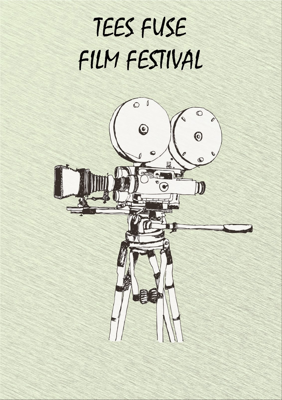
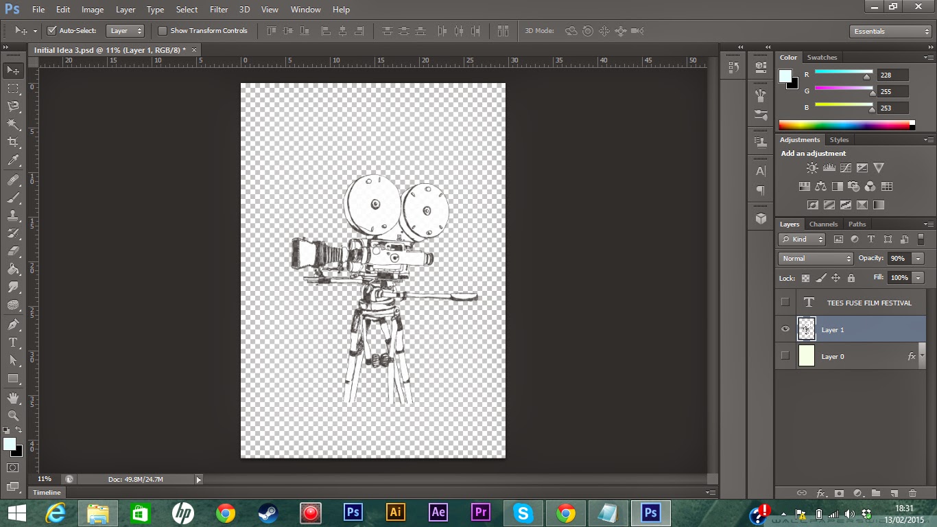
Initial Idea 3 - This design was very simplistic and in a way I wasn't satisfied with it, not because it doesn't look good, which I think it looks very appealing, but because there wasn't much of a challenge to create and edit it.The first thing I did for this design was to find a good sketch of a 16mm classic film camera, luckily I found one which was at a high resolution. I opened that image on Photoshop and removed the background using the Magic Wand. I had to use the Quick Selection Tool also to remove and add some places which need or did not need to be selected. Once I removed the background I imported it to the project and scaled and centred it accordingly.
After that I created a new layer which I would use as the background. I gave the background a very light green colour and also gave it a texture using an image which I found on the internet. This would give it less of a bland appearance.
To make the camera blend in more onto the design and not seem as its something glued onto it, I turned the opacity down to 90%.
The final thing I did was to add a text layer using the Text Tool. Unlike the previous designs I chose a suitable font for this one, as I felt like this one was closer to a finished product than the others. I used a pre-set font which was already installed on Photoshop and scaled and centred it accordingly.
As I mentioned previously, I felt like this design wasn't good because all I had to do was put an image on to a background. However the end result is very nice and looks appealing to the eye.
Final Design
After submitting the initial ideas to the client and receiving back the feedback, the client wants me to create a final design of the popcorn and cinema ticket idea. I'm really glad that one was chosen, as personally that one was my favourite one and I feel like it gives me a challenge to create it to a professional standard on Photoshop.The first thing I had to do was find an image of a 1950s style popcorn bucket which was large enough to use on an A3 poster, and wouldn't break up or look pixelated.
I removed the background using the Magic Wand tool and made a copy of the layer and turned it invisible. This is to have a reference of the original and have constant comparison to the original design, as I want it to look as similar to the original as possible.
Once I created a text layer I used the Eyedrop Tool to get the same colour as the red lines on the bucket. I also added a stroke which is the same colour as the background. Once I did these things for the first letter I simply duplicated the layer to keep the same attributes throughout and not have to do each of them individually by hand.
I repeated the same process for the location text layers. However as the original image had a different word at the top on the side as it did at the front, the gap wasn't large enough to fit the word "Middlesbrough" in without making the layer unreadable. So I had to use the Clone Stamp Tool to make another split in the red lines and give some extra space to fit the word in. Given all this the text still looks a little cramped, however the main focus would be on the one on the front.
The image of the cinema tickets are from an independent film maker company's website. https://the72project.files.wordpress.com/2014/02/cinema20ticket.jpg. I looked around on the website and saw that they give permission for anyone to use their images as long as they are not altered.
I scaled and tilted it accordingly and positioned the image so it would cover up the top of the side of the bucket and quite a lot of the middle text also.
I also gave the background a very light blue tone, so it wouldn't be on a plane white background.
I was able to meet the client in person (because of this I am unable to give any form of screenshots as to what we discussed) and have a discussion about the project. I showed the client the progress I had so far and asked if it looked good. The feedback I received was that it didn't specify the fact that it was a student festival, and recommended to include that somewhere on the poster. I decided the best thing to do would be to change the text on the cinema ticket which says "Cinema Ticket" to "Student Festival".
To do this I imported the original image of the cinema tickets into a separate project on Photoshop.
Once it was all removed I asked multiple people if it was obvious that I had removed the text, I received good feedback was told it was not obvious. Even if it would have been slightly obvious, having a text layer over it would ensure it wasn't visible.
Once again I was able to meet the client in person and show him the poster. I also explained to him how the date and logo would go at the bottom just below the popcorn bucket, which was fine by him. I also pointed out how next to the "UK" at the top of the bucket, the line was split, which had no reason to. The client asked me to join up the line, which I did immediately.
I exported the finished product as a .PDF and a .JPEG which is saved for web and submitted that to the client.
Evaluation
My brief was to create a simplistic A3 poster and a web flyer for the UK Cine Fest 2015 using Adobe Photoshop or Adobe Illustrator. I feel like my final product meets the requirements for the brief as it is a simple design and shows all the required information for the event. I have before hand discussed with the client that the date of the event and any logos will go at the bottom beneath the popcorn bucket, so although it's not on the finished piece of work, my client is aware of my intentions and has agreed with them. I also talked to the client about the actual finished design and he was very happy and seemed very pleased with the finished product, so I have high hopes that my piece of work will be chosen to be further developed and printed.
My target audience for this project were students between the age of 16 and 25 who are studying or are interested in the media industry. I feel like my finished design meets the needs of the target audience as the images seen on the poster are cinema and film related. It also has the appeal of a younger audience due to the light blue background, rather than using something darker. Although the items are retro and are 1950s style, they seem modernized in a way which would attract a younger target audience.
I feel like the most successful part of my design was the cinema ticket, which is a very clever, creative and effective way of getting the information across. Another successful part of the design the font used and the way in which the letters for "Cine Fest" are organized. The font seems natural and looks like it really is part of the original popcorn bucket and suits the 1950s retro style of the bucket. The alignment of the letters works well as it stands out and is the first thing seen and engages the viewer to further read the information on the poster.The one thing which I find didn't go so well and is rather off putting, is the "Middlesbrough" text. This text looks a little too crowded, this also applied to the text on the side of the bucket. This is the thing which I find makes the naturalness and originality fade from the project.Comparing it to this poster, from the Glasgow Film Festival, which I used as a guideline, there isn't any text which seems crowded or doesn't have enough border space. On some instances the text is close to the border but this is neutralized by the fact that other text goes over the border, implying that is the style the creator went for and did this on purpose. It is also clearly visible that the text has even and consistent space to either the red lines by it's sides or other text above and below it. |
| http://images.undergroundfilmjournal.com/wp-images/ sydney_underground_2012_small.jpg |
 |
| https://physicalimpossibility.files.word press.com/2013/02/popcorn-2013-red2.jpg |
No comments:
Post a Comment